Nearness
conceptual design
Design of a concept for an application based on the user's location
Mini data:
• Role: UX/UI Designer
• Time: 7-14 days
• Type: Concept / Fictional Client
• Tools: Figma, AI, Webflow (optional)
Modern social platforms like Facebook connect people globally — but not locally.
Despite living close to others, many people don’t know their neighbours, don’t share interests offline, and miss opportunities to connect in real life.
This new location-based social app is designed to change that.
It helps users discover people, groups, events and everyday opportunities nearby — all within walking distance.
Whether someone wants to find a workout buddy, borrow a tool, join a coffee meetup or simply feel more connected to their neighbourhood, the app creates a space where local interactions finally become easy, natural and safe.
Problem
Problem
• People living close to each other rarely interact or build relationships
• Finding local help (e.g. borrowing items, activities) is inefficient
• Existing platforms are global-first, not designed for neighborhood-level interactions
Goal
• enable fast local connections
• simplify finding people and resources nearby
• create a structured and safe neighborhood interaction
Why is it important?
it gives the opportunity to creating a neighborhood community.
User persona
“Tom Lewis – The Neighborhood Watcher”Age:61
Location:Manchester, UK
Profession:Retired
Motivation:Stay safe, stay informed, feel connected.Primary NeedsCrime/safety updatesLost & foundLocal alertsSimple communication with neighbors
“Sarah Holt – The Community Connector”Age:34
Location:Suburban Portland, OR
Profession:Elementary School Teacher
Motivation:Stay informed, organize small events, connect with neighbors.Primary NeedsHyperlocal newsCommunity eventsNeighborhood recommendationsSafety updates
Research
We need an app that works locally, enabling neighbors to get to know each other and collaborate. Facebook doesn't take advantage of this. An app that connects people living nearby, because maybe someone nearby can accompany us in our passion or help us with our needs.A lot of app works great, but no one base on location, enables meet new people in the neighborhood.
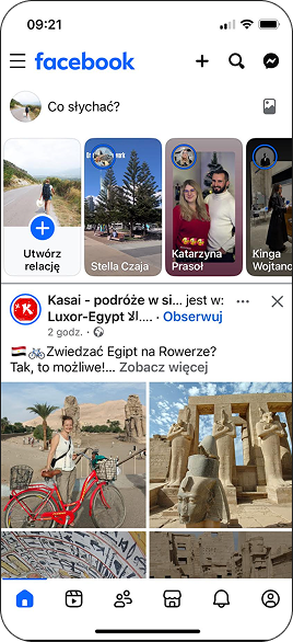
- 6 icon in navbar is too much
- rolls in fb is unnecessary
- market is also unnecessary
Jobs to be done
When I need a babysitter
Situation
I want to quickly find help in the area
Motivation
so I can someone who is close and needs some extra money comes over and helps
Expected outcome
When I have things I don't need
Situation
I want togetting rid of them without throwing them in the trash
Motivation
so I can neighbor and picks up the things, he is happy and so am I
Expected outcome
When accident in the area
Situation
I want toinformation about events in the area
Motivation
so I canquickly find out what's happening in the area
Expected outcome
Key Design Decisions
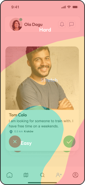
1. Location-first experience
The app is centered around the user’s immediate area instead of global content.
This makes interactions relevant and actionable.
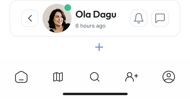
2. Simplified navigation
Reduced the number of main features to avoid overwhelming users.
Helps users quickly understand what they can do.
3. Focus on people & needs, not content feed
Instead of a typical social feed, the app prioritizes requests and connections.
Encourages real interaction instead of passive scrolling.
4. Trust-building elements
Profiles include basic identity and activity signals.
Reduces hesitation in interacting with strangers.
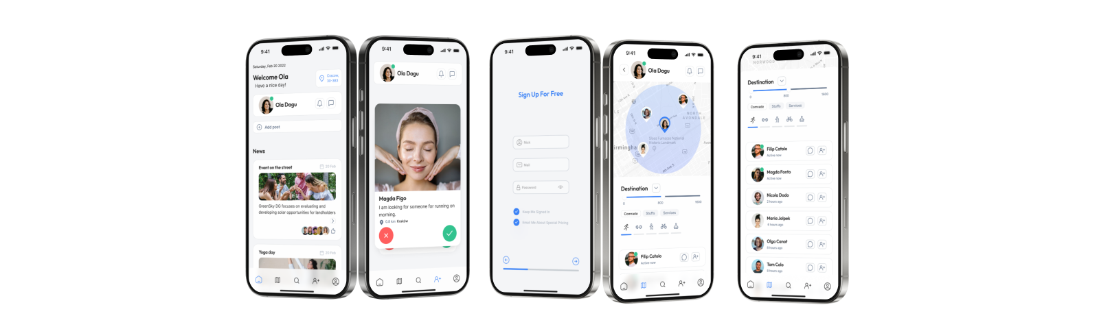
Wireframes
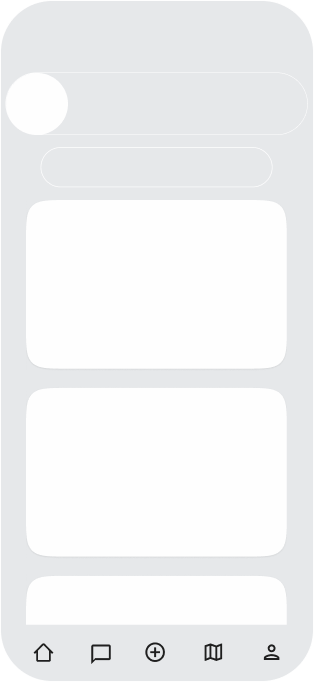
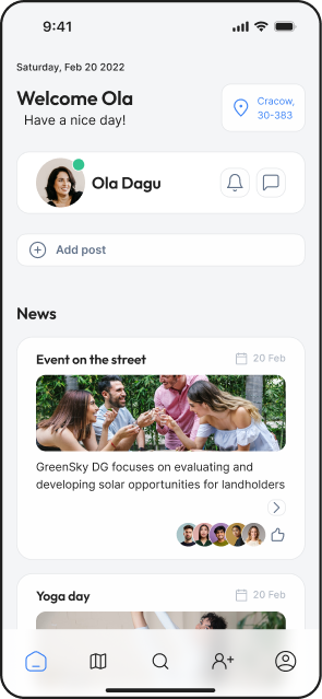
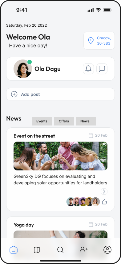
Main page:
-Welcome
-Your Name
-Add post
-Latest posts
Navbar
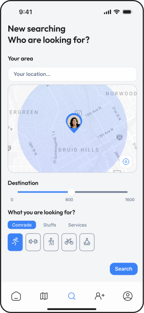
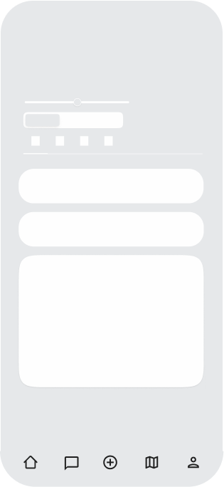
List of options:
-Distance
-Categories
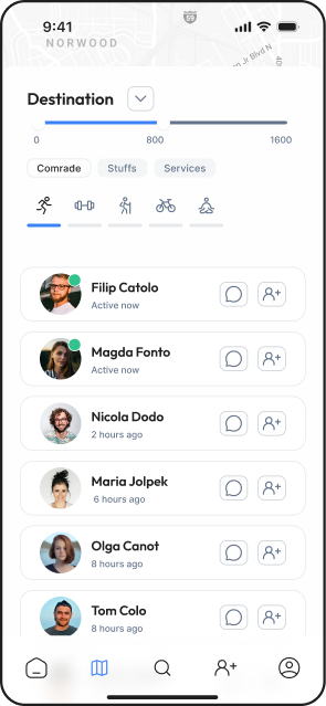
-List of people/options around
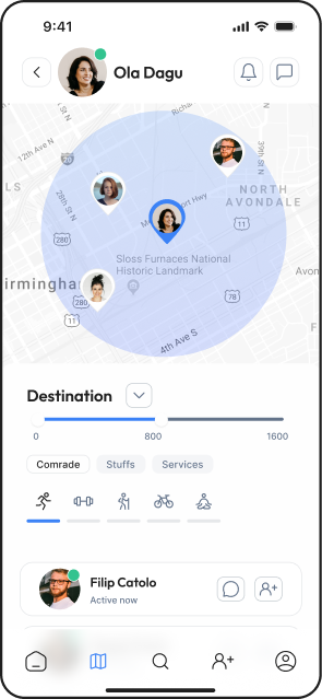
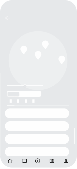
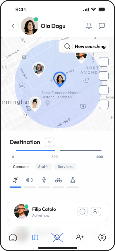
Map:
-Your area
-Distance
-Categories
-List of people around
Mobile Usability
Do we need add post here?
Maybe message should be in support top bar?
Final UI
Goals:
clear interface
easy to use
not messy
Components
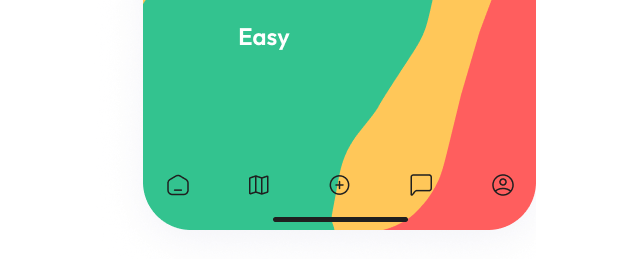
Why did I do that?
limited UI to reduce noise
clear CTA hierarchy
map + list for dual navigation
Views
Prototype
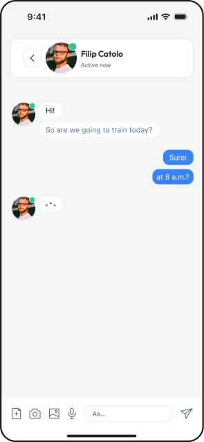
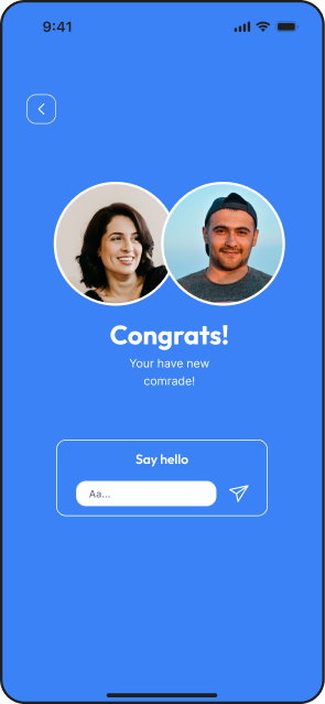
finding a neighborhood companion
End
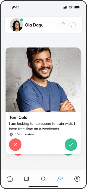
specifying who I’m looking for
finding a neighborhood companion
End
Conclusions
For me it was so complicated,
how make it not so messy?
what should be the most important, news, searching people?
scope was too broad → needs narrowing
biggest challenge: balancing simplicity vs features
next step: user testing on navigation clarity
maybe it should be News category