Cobra
conceptual design
Conceptual design of an application for finding people to collaborate with, projects and managing them.
Mini-data:
• Role: UX/UI Designer
• Time: 2–4 weeks
• Tools: Figma, FigJam, Webflow, AI
• Project type: Concept
Finding the right people to collaborate with in the tech industry is still harder than it should be. UX designers, developers and product specialists often rely on scattered channels — Facebook groups, Slack communities, LinkedIn, referrals — which makes the process slow, unorganized and dependent on luck rather than actual fit.
At the same time, managing ongoing work across multiple tools leads to confusion: tasks get lost, communication becomes messy, and freelancers struggle to keep track of responsibilities and progress.
This project introduces a dedicated app created specifically forIT professionals— a space where they can easily find collaborators, match with the right skills, and manage the entire workflow in one place.
From discovering designers or programmers for a project, to assigning tasks and tracking progress, the app aims to bring clarity, structure and efficiency to how small tech teams form and work together.
Problem
Problem
• projects are abandoned due to lack of reliable collaborators
• time is wasted on unstructured communication
• no visibility of commitment and skills
Goal
• reduce time to find collaborators
• increase project completion rate
• create structured collaboration flow
Why is it important?
it gives the opportunity to cooperate, create more projects, and builds a community
User persona
“James Carter – The Solo Developer Looking for a Team”Age:29
Goals
Find partners (UX designers, back-end devs) for side projects.Build his portfolio with collaborative, innovative apps.Eventually launch a startup MVP with a trusted small team.Connect with people who are equally motivated and consistent.
Frustrations
Hard to identify collaborators who are not just “idea people.”People often drop out mid-project.Other platforms (LinkedIn, Discord) are too noisy or not project-focused.Wants transparent skill levels and time commitment upfront.
“Ava Thompson – The UX Designer Seeking Meaningful Collaboration”
Age:33
Goals
Join passion projects that allow her to explore new ideas.Find developers who appreciate UX and usability testing.Collaborate efficiently using design tools and shared workflows.Expand her network beyond the typical design community.
Frustrations
Developers sometimes underestimate UX or skip usability testing.Difficulty finding projects that align with her interests (health, social impact, education).Many collaboration platforms aren’t curated, so quality varies widely.Wants clarity on project timelines and leadership structure.
Research
We need a simpler way to find people who are ready to collaborate. Motivation, visibility into what other colleagues are doing, and a browser for possible projects are key here.
Jobs to be done
When I have a project idea
Situation
I want toquickly find designers and developers with complementary skills
Motivation
So I can turn my idea into a working prototype faster
Expected outcome
When I browse potential coworkers
Situation
I want toset clear expectations (timeline, roles, responsibilities)
Motivation
so I canavoid misunderstandings and keep the project consisten
Expected outcome
When joining a new team
Situation
I want tofeel my expertise is respected and acknowledged
Motivation
so I cancontribute confidently and stay engaged
Expected outcome
Issue Tree
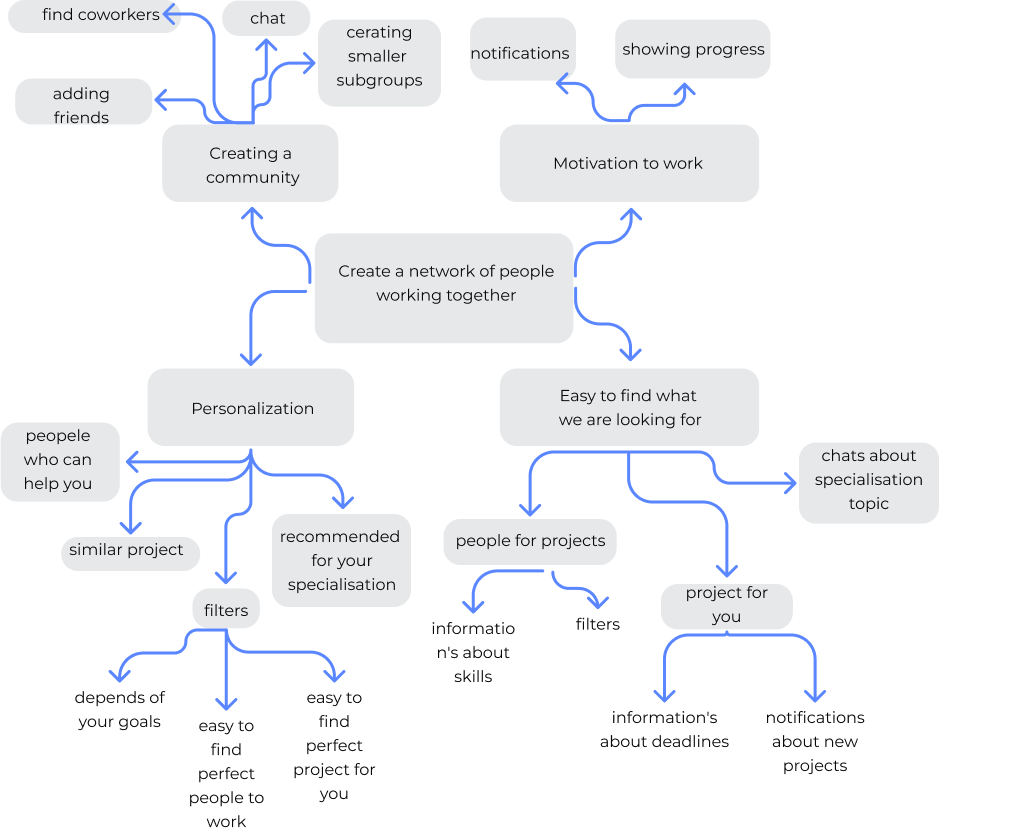
Key Design Decisions
1. Matching instead of open browsing
Instead of a typical job-board style browsing, I introduced a matching system to help users quickly find relevant collaborators based on skills and availability.
This reduces time spent searching and increases the chance of finding committed partners.
2. Simplified dashboard instead of complex project management
Instead of building a full project management tool, I focused on a lightweight dashboard showing only key progress and responsibilities.
This avoids overwhelming users and keeps the app focused on collaboration, not task management complexity.
3. Profile transparency (skills + availability)
User profiles include not only skills but also availability and commitment level.
This helps avoid a common issue where collaborators drop out mid-project.
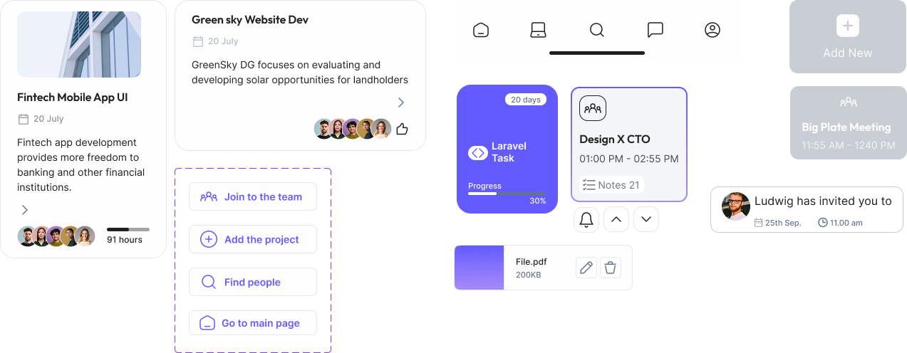
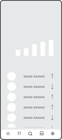
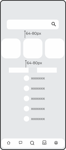
Wireframes
several wireframes showing how the application is supposed to work
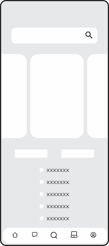
The project you can join:
-Search
-Recomended to you
-Filer/sort
-Other
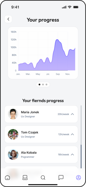
Your progress:
-your progress diagram
-your fiernds progress
Find coworkers:
-Search
-Recomended to you
-Filer/sort
-Other
Mobile Usability
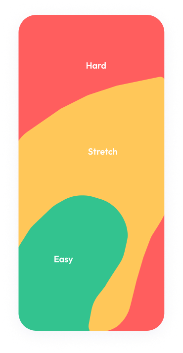
Moving parts below, information and headings higher in the hard-to-reach part.
Maybe access to project is more important than access to message?Maybe searching button is more important than adding button?

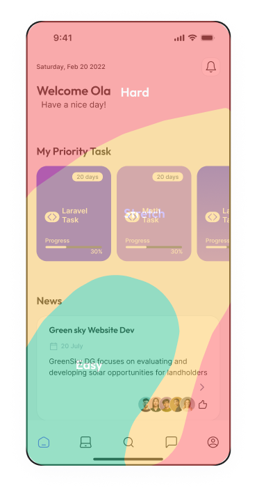
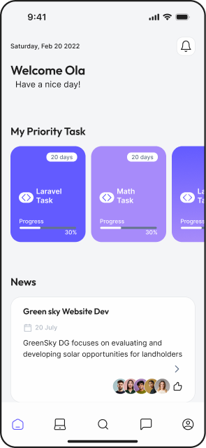
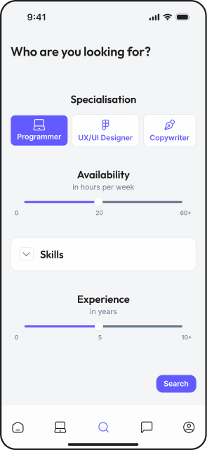
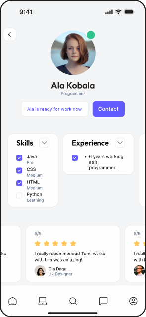
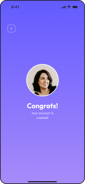
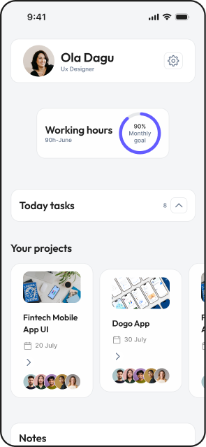
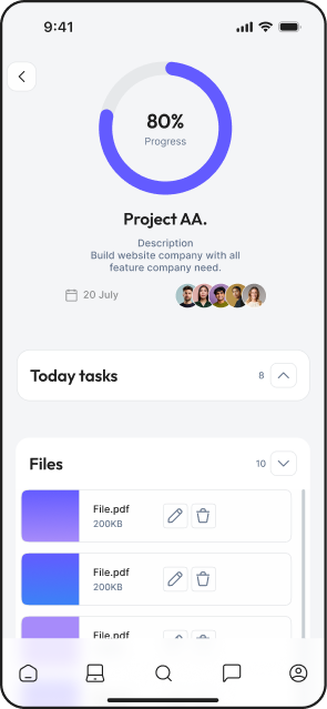
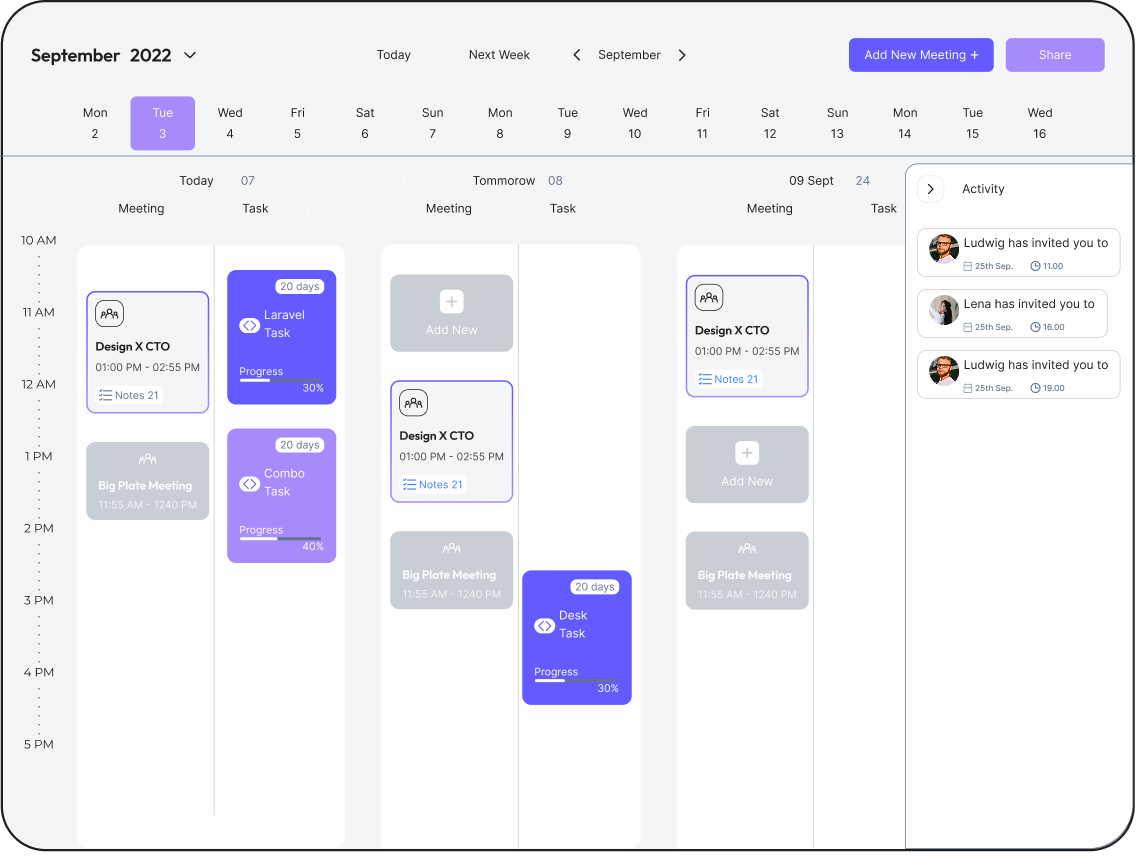
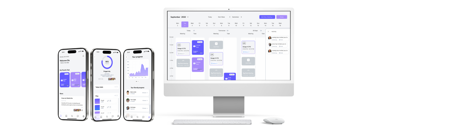
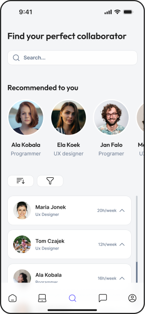
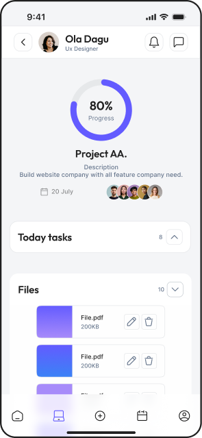
Final UI
Goals:
• clear interface
• easy to use
• not messy
Components
Why did I do that?
UI Decisions
1. Limited color palette
I used a minimal color system to reduce cognitive load and keep the interface focused on actions.
Users can quickly scan and understand what to do next.
2. Purple as primary action color
Purple is used consistently for all key actions (CTA, links, interactions).
This creates a clear visual pattern and improves usability.
3. Neutral interface for different user types
The UI avoids strong stylistic elements to stay neutral for designers, developers, and product managers.
This makes the platform feel universal and professional.
Views
Prototype
work with perfect person/ team
End
specifying who I’m looking for
work with perfect person/ team
End
Conclusions
Should be more to find person, just it or to control your project? Do we need 2 app one for searching people and one for project control?This is wide range, how not to get lost?
Maybe add information about availability, mini view of profile
maybe I should add support top bar with message and notifications and I will have a spce to add calendar to navbar